The Transition Navigator
- Brand Idenity
- CMS
- Web Design
- Web Development

The Brief
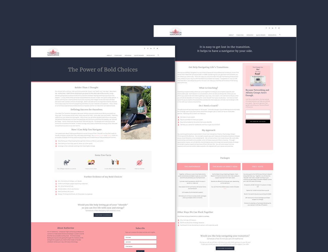
The Transition Navigator is a life and business coaching service developed by Katherine Porter. Since the business was just starting out, it needed everything from the ground up. Katherine said if she was designing a logo and website it would be all pink daisies and ribbons. The approach was to bring in those feminine elements and marry them with a clean and functional design. As a new business, Katherine did not have any graphic work or professional photography so the challenge for the website was to display text heavy content in a way that was visually interesting.

The Result
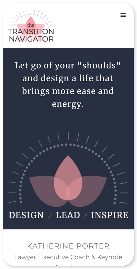
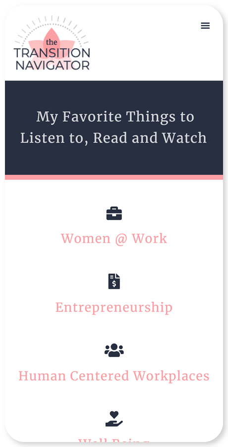
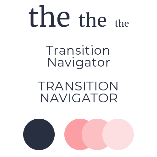
Branding for anything related to Katherine had to include pink. A very dark blue was used as a contrasting color to help the pink stand out. The essence of a compass and shaded flower were used to embody the “navigator” element of her business name and target female audience. Throughout the website, color blocks were used to break up the content and call attention to key action items such as downloading her free e-guide and scheduling appointments. Functionally, the site contains a blog, integration with other business management tools, social media integration and responsive design.


